Three Data Visualization Techniques That Can Be Used in Laboratory Systems to Improve Discovery

"Good data scientists know that storytelling is essential to unlocking the power of data" - DJ Patil Nation's first Chief Data Scientist. As we are bringing the power of data science into the lab, these words continue to rattle around my brain. What discoveries can these techniques help to unearth? Our leader, Patrick Callahan, likes to say ‘The cure for cancer could be sitting in the data somewhere.’ These words have never felt more true than they do now, as we work with laboratories to use data science and engineering techniques within their LIMS systems. 

In today's world of science, laboratories generate vast amounts of data, from sample analysis to experimental results, and it can be challenging to extract meaningful insights from this data. In his book Info We Trust, RJ Andrews wrote “Data is a powerful tool. But without context and narrative, it is meaningless. Storytelling is the missing link, the key to unlocking the power of data.” Data visualization techniques can help laboratories to improve their data analysis, decision-making capabilities, and storytelling. Here are three advanced data visualization techniques that can be used in laboratory systems to improve discovery. 

Heatmaps

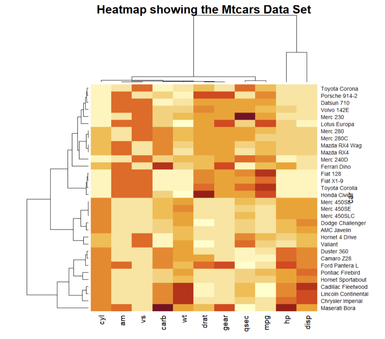
One of my favorite visualization techniques is a heatmap. Heatmaps are a data visualizations that use color coding to represent data values. Heatmaps can be used to visualize complex data sets, such as gene expression data, to quickly identify patterns and trends. In a heatmap, rows represent different samples or conditions, and columns represent different genes or variables. The colors in the heatmap represent the expression level of each gene in each sample or condition. I regularly use heat maps for visualizing correlation coefficients, time series volume by day and time, and volume by a cross-section of segmentation. In the web analytics and marketing space heatmaps are used for comparing different market segments. Researchers can use heatmaps to identify differentially expressed genes, which are genes that are expressed differently between different conditions or samples.

Sankey Diagrams

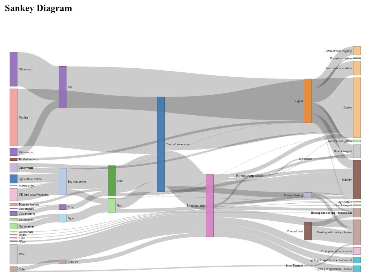
Sankey diagrams are a data visualization technique that uses a flowchart to represent the flow of data or materials. These diagrams can help to highlight state change.  They are commonly used to illustrate complex processes or systems, such as industrial processes, transportation networks, or energy systems, in a clear and concise way. Businesses often use Sankey Diagrams when doing churn analysis to show the flow of customers through a given sales pipeline or process. Visualizing the data this way tells a clear story of what happens to customers. Researchers could use Sankey diagrams to visualize complex experimental workflows, such as the flow of samples through different laboratory processes. This technique can help to highlight potential bottlenecks or inefficiencies in their experimental workflows. By optimizing practical workflows, researchers can save time and resources and increase the efficiency of their research.

Parallel Coordinates Plot

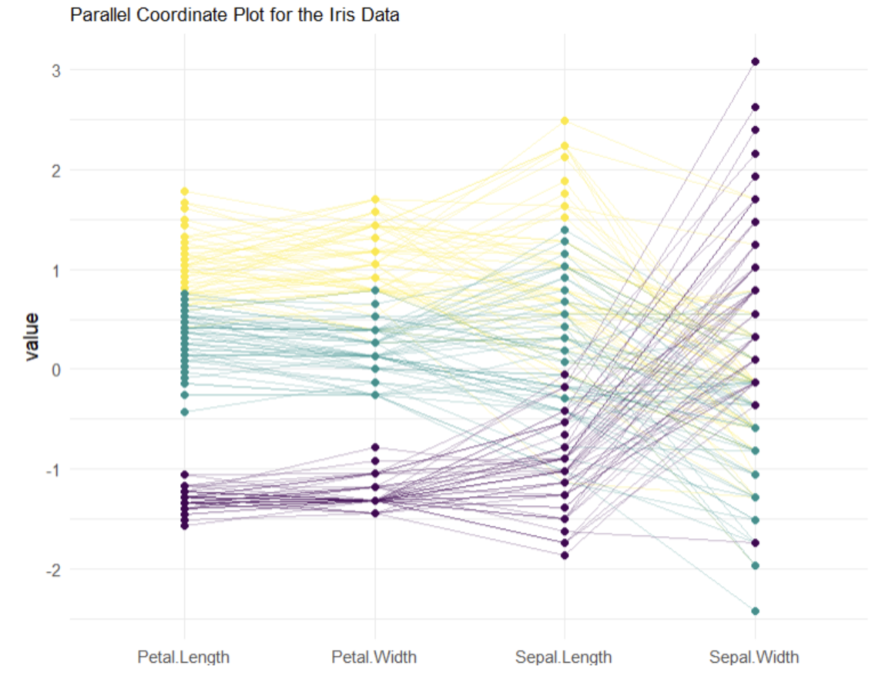
A parallel coordinates plot (PCP) is a data visualization technique that is used to visualize high-dimensional data sets. In a parallel coordinates plot, each variable is represented as a vertical axis, and each data point is represented as a line that connects the values of the variables. These plots are used to compare multivariate numerical data. PCP is used to identify patterns or trends by comparing how numeric variables relate to each other. These plots can be used for dimensional analysis and feature reduction. Parallel coordinates plots can be used to visualize complex data sets, such as gene expression data or metabolomics data, that have many variables. Researchers could use this technique to identify clusters of data points that share similar characteristics or identify variables that strongly influence the outcome.

Parallel coordinates plots can also be used to identify potential outliers or anomalies in the data set. By identifying outliers, researchers can investigate potential errors in the data or identify potential areas of interest for further investigation.

Conclusion

Data visualization can be powerful a tool for improving data analysis, decision-making, and storytelling in laboratory systems. By using heatmaps, Sankey diagrams, and Parallel Coordinate Plots researchers can uncover hidden patterns and relationships in their data, identify potential areas of interest, and optimize the experimental design. Alberto Cairo, a data visualization expert, said “Data visualization is an art of storytelling. It's the art of turning dry data into engaging visual stories that captivate and convince your audience.” Using data visualization techniques in laboratory systems can not only lead to faster discovery and the development of new and more effective treatments and therapies it can also help to communicate these findings to a wider audience.

Unlocking the Power of Data Engineering in the Science Lab

Image Courtesy of Dall-E

 Today scientists are solving complex problems that impact people across every industry. Central to this workflow is the Laboratory Information Management System (LIMS), which allows researchers to organize and manage their data. These systems are exceptional at collecting and storing data, but analysts and data scientists often have to work outside of the laboratory system to identify meaningful insights and discoveries. This disconnect can lead to delays in project timelines and tax already limited resources. Adding a data science tool stack to the LIMS environment will enable scientists to discover the next best solution, whether it be in the commercial or public health industries.  

Early this year LabWare acquired Data Science company CompassRed (LabWare Analytics) to help develop the functionality that enables data scientists to support laboratory scientists in the LabWare LIMS environment. Below we describe how data science tools can activate scientific data and discuss what functions we are adding to the LIMS environment.

The Value of Scientific Data

Data is increasingly valuable for companies creating superior products. In general, data can be used to identify trends, optimize processes, and inform decisions. In the lab, data can help spot anomalies, identify hidden relationships, and optimize laboratory functions. Ultimately, data is valuable because it allows organizations to make informed decisions that grant them a competitive advantage. Within a lab that is collecting scientific data with a LIMS system, a variety of tools can help bring that data to life and create a competitive advantage for the organization.

Activating scientific data is difficult due to the advanced analytics and technologies involved in making sense of the raw data. Data activation converts it into a format that can be easily understood and used to draw meaningful insights. This can be done in a variety of ways, such as (1) organizing the data so it is easier to analyze, (2) creating visualizations to make it easier to understand, and (3) using machine learning and artificial intelligence to develop predictive models. Other methods of activating scientific data include developing algorithms to automate information processing and analysis, developing tools to facilitate data sharing, and creating digital tools to help researchers understand the data. 

Why bring Data Science tools into the lab?

Image Courtesy of Dall-E

LabWare Analytics believes that scientists should be able to activate the scientific data collected within LIMS systems by incorporating data science tools into the laboratory. With best in class tools scientists can more quickly and accurately interpret their data, identify patterns and trends in their process, and gain a more comprehensive understanding of their experiments. This can lead to more effective and efficient research processes, as well as more sophisticated, accurate, and reliable results.

The following are some of the most common data science tools scientists use that we bring to the LIMS system:

1. Data Visualization Tools: Data visualization tools allow scientists to graphically represent their data in a meaningful way, providing a comprehensive understanding of the data. These tools can be used to create interactive data visualizations, such as line graphs, scatter plots, and histograms, as well as maps and other interactive visuals. By bringing a modern visualization package into the LIMS system we believe scientists will be able to do their work more effectively.

Image Courtesy of Dall-E

2. Statistical Analysis Tools: Statistical analysis tools allow scientists to analyze data and draw insights from it. General-purpose programming languages like R and Python can be used for statistical analysis. These tools can improve scientists’ ability to identify relationships between data points, test hypotheses, and calculate the probability of certain outcomes within the LIMS system.

3. Machine Learning and AI Tools: Machine learning and AI tools allow scientists to develop models and algorithms that can analyze large amounts of data and identify patterns, trends, and correlations that may not be visible to the human brain. These tools can enable scientists to run ML models that make predictions, identify anomalies, and automate data processing and analysis.

4. Data Sharing and Collaboration Tools: Data sharing and collaboration tools allow scientists to easily share data and collaborate on projects. These tools allow for secure data sharing and can be used to store, organize, and analyze data. These tools will help validate results and improve the reproducibility of a scientific study.

5. Data Management and Storage Tools: Data management and storage tools allow scientists to store and manage their data in a secure and organized way. These tools can be used to store data in the cloud, back up data, and access data from any device. Scientific organizations are often utilizing many systems. Improving the data management and storage capabilities can enable an organization to focus more on scientific methods and discovery without accumulating technical debt.

Image Courtesy of Dall-E

A Science and Engineering Approach

By integrating data science tools into the laboratory, scientists can more quickly and accurately interpret their data, identify patterns and trends, and gain a more comprehensive understanding of their experiments. To do this our data scientists and data engineers are focused on bringing the foundational tools into the Labware LIMS system. This starts with enabling the use of R within workflows and general calculations. This will fundamentally improve the data visualization functionality of the LIMS client, and shape improved data models for analytics and data science work.


Who is Labware Analytics?

At the beginning of 2022, Labware acquired the Data Science consulting firm CompassRed. By doing so, they acquired a team of highly skilled and experienced data engineers, scientists, and analysts. The CompassRed team comes with a variety of experience, such as building and productionalizing machine learning models, developing advanced analytics data pipelines, and building data visualization and BI tools. The CompassRed team has spent the last nine months listening to LIMS consultants and clients, deep diving into how the LIMS system works, and attending LabWare Customer Education Conferences (CEC) and other industry conferences. Through these experiences, we have developed an opinion that a Data Science solution needs to be added to the LabWare LIMS system.

LabWare Holdings Acquires CompassRed - Establishing Data Analytics Innovations Center

LabWare Holdings Acquires CompassRed - Establishing Data Analytics Innovations Center

LabWare Holdings today announced it has signed a definitive agreement to acquire CompassRed, a visionary company in machine learning and predictive analytics. The acquisition of CompassRed will create a new dedicated advanced data analytics arm in LabWare, embedding the CompassRed solution into the core LabWare platform, and providing services that will further elevate LabWare’s position as the global leader in the Laboratory Information Management market.

Top 3 Things I Learned from Attending a Cannabis Conference

Top 3 Things I Learned from Attending a Cannabis Conference

We saw that the business needs we help meet for our current clients are similar to the ones we talked about with cannabis vendors at MJBizCon: “I need to reduce costs”, “I need to optimize my production process”, “I need to better attract new customers”. These statements underline the need for good data solutions for people making decisions in every industry.

Synthetic Data in Data Science

Synthetic Data in Data Science

At Compass Red, synthetic data is enabling rapid development cycles as we solve specific problems for our clients. One of our more cutting edge clients is working with us to create a prototype analytics solution for their end clients. We set up a demo of the proposed solution using synthetic data to protect the privacy of their end clients, which allows us to gather feedback quickly and also allows our client to do business development using the prototype.

We Did It Again!

We Did It Again!

We made the Inc5000 list again this year - two years in a row. It's times like this, when you get a little bit of recognition and validation into what you are doing, that helps you dance on and at times dance a little wilder. Making the list of the 5,000 fastest growing companies in the country for the second consecutive year is a strong validation for us. Especially in a year like the one we had. We worked hard to commit to not losing one teammate unless they chose another path, to continue to work hard for our clients, and to add a few more dancers to our circle.

CompassRed Welcomes Summer 2021 Intern Class

CompassRed Welcomes Summer 2021 Intern Class

At CompassRed, we believe in the value of internships as well as the benefit that both the student and the organization receive. We are excited to officially introduce CompassRed’s Class of 2021 Summer Interns that are joining us from May through the end of August. This will be CompassRed’s 5th official class of interns and consists of four team members with skills ranging from data science to security and visualization.

Why It’s Time to Switch to Google Analytics 4

Why It’s Time to Switch to Google Analytics 4

Google sent a clear message when they removed the ability to set up a new instance of GA3 -- this version is on its way to the software graveyard. It doesn’t seem like deprecation is right around the corner, but it will eventually come. Instead of holding out and being forced to scramble into a hectic migration, why not start the process early and start benefiting from free new features?

If you use GA3 and need help making the switch, reach out to us today at info@compassred.com or directly to dmalfitano@compassred.com.

The 14 Best Practices to Consider in Data Visualization

The 14 Best Practices to Consider in Data Visualization

A good visualization tells a story, can shine a light on a lot of hidden information and details that we would not uncover in a spreadsheet, bar chart, or pie graph and finally, it enhances greater attention because it keeps the audience focused on the subject matter. With data visualization, organizations can tap into the true potential of their data, and they can do this quickly, efficiently, and effectively.

The Importance of Portfolio Projects in Data Analytics

The Importance of Portfolio Projects in Data Analytics

Recently, I had the opportunity to talk with Masters students at Temple’s Fox School of Business about successful interviewing. Many of these students are in the Business Analytics MS program, curious about the interviewing process and what we look for in a candidate at our data analytics & data strategy company. At CompassRed, we’re passionate about hiring data team members who demonstrate creative problem solving and self-sufficiency.

7 Dataviz Gems You May Have Missed - Data Viz Roundup ICYMI

7 Dataviz Gems You May Have Missed - Data Viz Roundup ICYMI

If you’re anything like me, these days “the feed”, regardless of platform, is driving what you’re reading and where you’re spending your time. And with current events dominating my feed in January, I’m 100% sure I missed some great stuff in the Data Viz world. So for this post, I decided to get my head out of the feed to cast a wider net and share a few unusual gems you may have missed.