

The 14 Best Practices to Consider in Data Visualization
A Picture Says a Thousand Words
Our eyes are drawn to colors and patterns. We can quickly identify red from blue, square from circle. Our culture is visual, including everything from art and advertisements to TV and movies. We are an inherently visual world, where images speak louder than words. Data visualization helps to tell stories by curating data into a form easier to understand, highlighting the trends and outliers. A good visualization tells a story, can shine a light on a lot of hidden information and details that we would not uncover in a spreadsheet, bar chart, or pie graph and finally, it enhances greater attention because it keeps the audience focused on the subject matter. With data visualization, organizations can tap into the true potential of their data, and they can do this quickly, efficiently, and effectively.

Did you know? 90% of the information transmitted to the brain is visual.
What Makes a Good Visualization?
When you want to make an impression that’s both immediate and long-lasting, data visualization is one of the most powerful tools at your disposal. A great data visualization should leverage the strengths of the human visual system to display data so that it can be readily absorbed and understood. It should consider what we know about visual processing to enhance and ease the viewers experience of the data. Data Visualization is new storytelling. While bad stories may lead to bad memories, bad visualizations of your business data can lead to wrong conclusions that can hamper or – even worse – tank your business. Therefore, the quality and capabilities of data visualization directly influence how data impacts your business strategy and what benefits data applications can bring to the companies and their industries.
Guiding Principles to Make Data Visualization Effective
Here at CompassRed, we have some of the industry’s premier data visualization specialists who have compiled our team’s best visualization strategies to help clients fix common data design mistakes and enhance their existing visualizations.

To start, let’s remember one strong motto – “Design choices you make should enhance your reader’s experience—not yours.” It is important to match your visualization to your viewer’s information needs. You should always be asking yourself: “What are they looking for?” What type of decisions do your viewers make? What information do they already have available? What additional information can your charts provide? Do they have time (and interest) to explore an interactive website, or should you design a one-page handout that can be understood at a glance?
1. Design for a specific audience:
A visualization is meaningless if its viewer cannot use it. Know who your audience is. This will allow you to design your visualizations in a way that makes the most sense to them and presents the data everyone needs. If your audience is a novice, make your report/dashboard more instructional and give directions to guide the experience.

2. Agree on a methodology:
Establish a routine for how data visualization is produced by everyone involved in your team. Standardize the data acquisition process, visual schema and design parameters and adhere to these strictly. The future of visual analytics and data storytelling will require an emphasis on data governance. Traditional business intelligence tools provide some degree of governance but it's our responsibility to incorporate it on the right level. This will ensure consistency in all visualizations, and the target audiences will become accustomed to reading them easily.
3. Choosing the right BI tool:
There are hundreds of BI tools available in the market. Focus on these key areas to help your organization objectively evaluate different tools and find the best fit. Some of the key factors are number of data sources, data transformations, data access via built-in connectors, data volume can significantly impact the performance of the tool, sharing reports, exporting data out of the reports, level of interactivity, creating custom charts and most important of all is the cost.

4. Ordering and prioritizing hierarchy:
Develop a habit of ordering your visuals intuitively. Typically our brain enforces our default eye movement to be from left to right and top to bottom. So make sure to add your most impactful visuals in the common habitual reading patterns. Random patterns that are difficult to interpret are frustrating and detrimental to what you are trying to communicate.
5. Selecting the right charts:
We can visualize the data in many ways. But selecting the right charts for your specific project, audience, and purpose is an effective means of visualization.

6. Avoid using distracting fonts or elements:
Unless you do emphasize a point, do not use bold or italic text. Remember not to use them both at the same time.
7. Do not omit missing data:
The absence of data is a powerful story by itself, do not ignore the nulls and skip time intervals because there is no data to visualize. Rather ask Why was the data missing? and provide an answer. Instead of ignoring missing data, label the data appropriately, add a note and find a way to visualize it.
8. Empower the user:
Instead of bombarding viewers with more information, nudge them to find and focus on insights that are relevant to them. Let them decide what they want to see and use filters and selectors to accomplish the same. Meanwhile, remember that the balance here is very important. Too much choice for the end user can result in confusion or overload, but the right amount of selection makes them feel in control and improves the report experience.
9. Use of size to visualize values:
Size can help emphasize poignant information and add contextual clues. Instead of using color, shape size can adjust based on data values. When you have several data points in the same size on a visualization, they blend and it is difficult to differentiate values. Making size relative with value, and adding color as another marker, the visualization is easier to navigate.

10. Color is important:
Colors can convey so much without using words. Keeping it simple is best. Use color to highlight and accentuate the information. Be consistent across your visualizations. Choose colors based on your target audience. Utilize clear differentiation to recognize various components of the dashboard and grey out anything that’s not important.

11. Sort your data:
Any visualization should not only clarify but also allow the reader to retain the information presented. Retention happens when the charts don’t have a high cognitive overload. A way to reduce cognitive overload is to sort your data. This makes comparisons easier by sorting the data from the lowest to the highest values if they are numbers, and alphabetically if they are categories.

12. Accurate scaling:
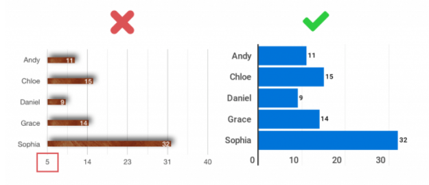
Represent the data accurately in proportion to the scale. The size of the chart or symbol should be proportional to the data point being represented.
13. Labelling:
Label the axis correctly and consistently across all your charts. Avoid using acronyms that are not widely understood. Make the chart title as concise and accurate as possible. Use tooltips rather than labels wherever appropriate to annotate specific data points.

14. Tell the whole story:
Maybe you had a 30% sales increase in Q4. Exciting! But what’s more exciting? Showing that you’ve actually had a 100% sales increase since Q1.
All of the above best practices root down to the one most important thing - Finding the right balance between complexity and clarity that aligns with the needs of your audience. It’s always tempting to make a beautifully detailed, subtle, exploratory visualization, but that’s rarely the most appropriate approach. Keep a checklist of our best practices to make a greater impact in your visualizations and let your data uncover the intelligence and insights that are required for today’s world to make successful decisions.