

7 Dataviz Gems You May Have Missed - Data Viz Roundup ICYMI
By: Darren Mahoney
If you’re anything like me, these days “the feed”, regardless of platform, is driving what you’re reading and where you’re spending your time. And with current events dominating my feed in January, I’m 100% sure I missed some great stuff in the Data Viz world. So for this post, I decided to get my head out of the feed to cast a wider net and share a few unusual gems you may have missed.
Take Some Time To “Visit”: Exploring-time a Data Viz Exhibit
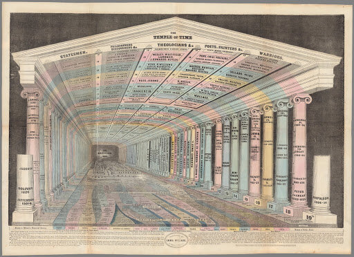
Check out Data Visualization and the Modern Imagination by Stanford Libraries. This in-person exhibit was open in the fall, but there is an online version that can be enjoyed remotely.
“This exhibition is the culmination of a partnership between RJ Andrews, a data storyteller based in San Francisco, and the David Rumsey Map Center. RJ weaves stories together by creating beautiful graphics that are informed by science and presented using effective design.”
I recommend spending some time with the “Temple of Time” viz. It’s one of my favorites in the “Exploring Time” section; pretty amazing work by Emma Willard (1846).
Map it... An Extremely Detailed Map of the 2020 Election
This map will have you clicking and exploring for longer than you would think. The granularity is fascinating; candidate differences can be viewed at a molecular level, which had me analyzing differences between neighborhoods.

John Keefe (@jkeefe) Side by Side Tweet on Representing Data
I’m a stickler for sourcing data, clearly labeling charts, giving context by showing data over time, etc. etc. I love this tweet thread. Stuff that shouldn’t have to be said, but then again can’t be left unsaid.
Must Read: Jessica Davidson’s Data for Good: Why Non-Profits Should Think More About Dataviz
Jessica’s post was shared a lot recently and for good reason. More and more nonprofits are being asked to be more data-driven, evidence and performance based. Nonprofit leaders, this one is bookmark worthy. I’d say read it more than once, I did. Her lessons apply more broadly but non-profits that are being asked to do more with less will benefit from Jessica’s “lessons learned from a non-profit insider.”
Get lost: Worldbank’s Atlas of Sustainable Development Goals 2020.
Wow, just so many important data stories. Well done. And, so...much...scrollytelling. Or sit back and watch the replay of the live launch event.

So to recap, I missed a LOT. Glad I took the time to catch up. While I make changes to my twitter/reddit feeds - following (often) and unfollowing (less often) accounts, clearly still there are big things going on that I’m missing. I hope you found something of value. If you did, please share with others.
Bonus - You Should Check Out From The Delaware Data Innovation Lab

The team at the lab created their own Data visualization around eviction filings in New Castle County, Delaware during the COVID Pandemic. The Flow shows each neighborhood's 2020 eviction filings (shown in blue) are way below their values of historical eviction filings (avg, 2016-2019; shown in green). I am proud of the work being done by our fellows at the lab and look forward to sharing more visualizations with you all.
CompassRed is a full-service data agency that specializes in providing data strategy for clients across multiple industries.