"Good data scientists know that storytelling is essential to unlocking the power of data" - DJ Patil Nation's first Chief Data Scientist. As we are bringing the power of data science into the lab, these words continue to rattle around my brain. What discoveries can these techniques help to unearth? Our leader, Patrick Callahan, likes to say ‘The cure for cancer could be sitting in the data somewhere.’ These words have never felt more true than they do now, as we work with laboratories to use data science and engineering techniques within their LIMS systems.
In today's world of science, laboratories generate vast amounts of data, from sample analysis to experimental results, and it can be challenging to extract meaningful insights from this data. In his book Info We Trust, RJ Andrews wrote “Data is a powerful tool. But without context and narrative, it is meaningless. Storytelling is the missing link, the key to unlocking the power of data.” Data visualization techniques can help laboratories to improve their data analysis, decision-making capabilities, and storytelling. Here are three advanced data visualization techniques that can be used in laboratory systems to improve discovery.
Heatmaps
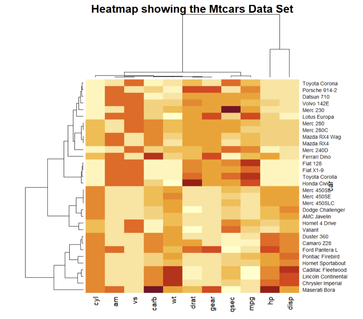
One of my favorite visualization techniques is a heatmap. Heatmaps are a data visualizations that use color coding to represent data values. Heatmaps can be used to visualize complex data sets, such as gene expression data, to quickly identify patterns and trends. In a heatmap, rows represent different samples or conditions, and columns represent different genes or variables. The colors in the heatmap represent the expression level of each gene in each sample or condition. I regularly use heat maps for visualizing correlation coefficients, time series volume by day and time, and volume by a cross-section of segmentation. In the web analytics and marketing space heatmaps are used for comparing different market segments. Researchers can use heatmaps to identify differentially expressed genes, which are genes that are expressed differently between different conditions or samples.
Sankey Diagrams
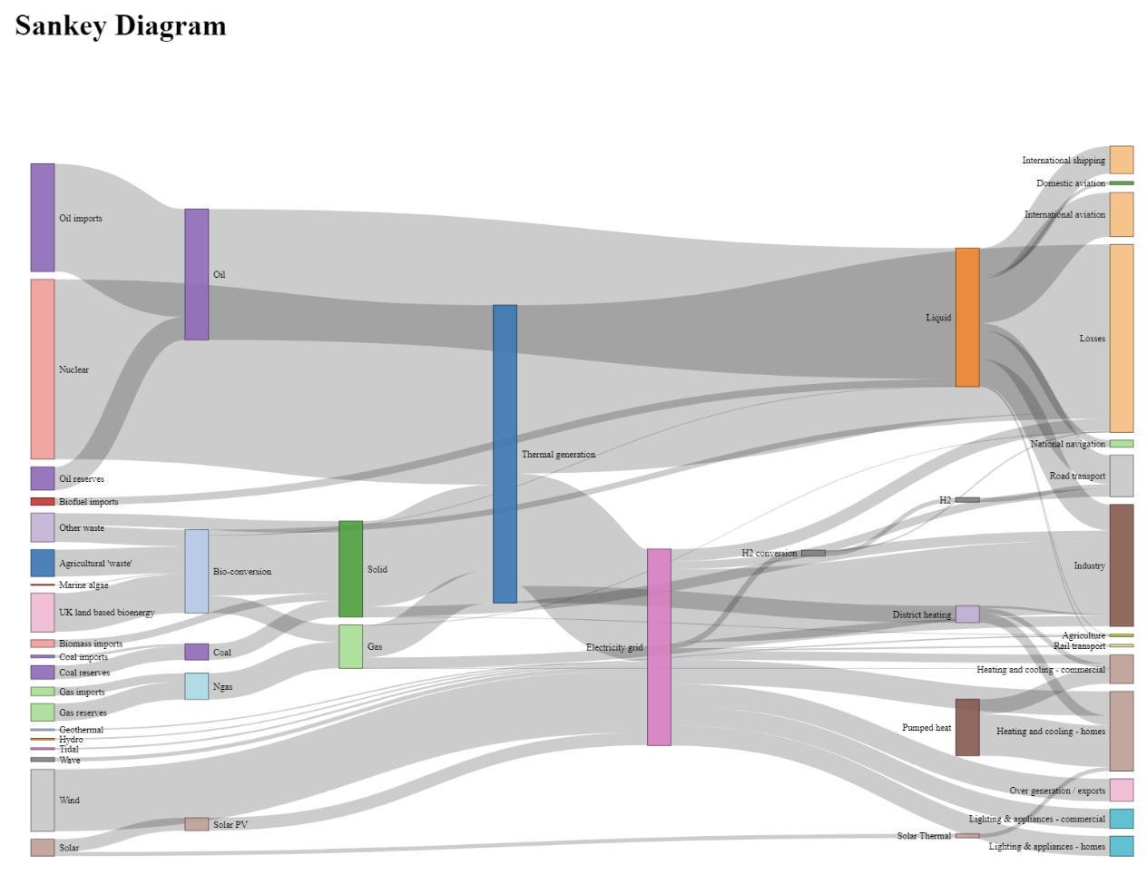
Sankey diagrams are a data visualization technique that uses a flowchart to represent the flow of data or materials. These diagrams can help to highlight state change. They are commonly used to illustrate complex processes or systems, such as industrial processes, transportation networks, or energy systems, in a clear and concise way. Businesses often use Sankey Diagrams when doing churn analysis to show the flow of customers through a given sales pipeline or process. Visualizing the data this way tells a clear story of what happens to customers. Researchers could use Sankey diagrams to visualize complex experimental workflows, such as the flow of samples through different laboratory processes. This technique can help to highlight potential bottlenecks or inefficiencies in their experimental workflows. By optimizing practical workflows, researchers can save time and resources and increase the efficiency of their research.
Parallel Coordinates Plot
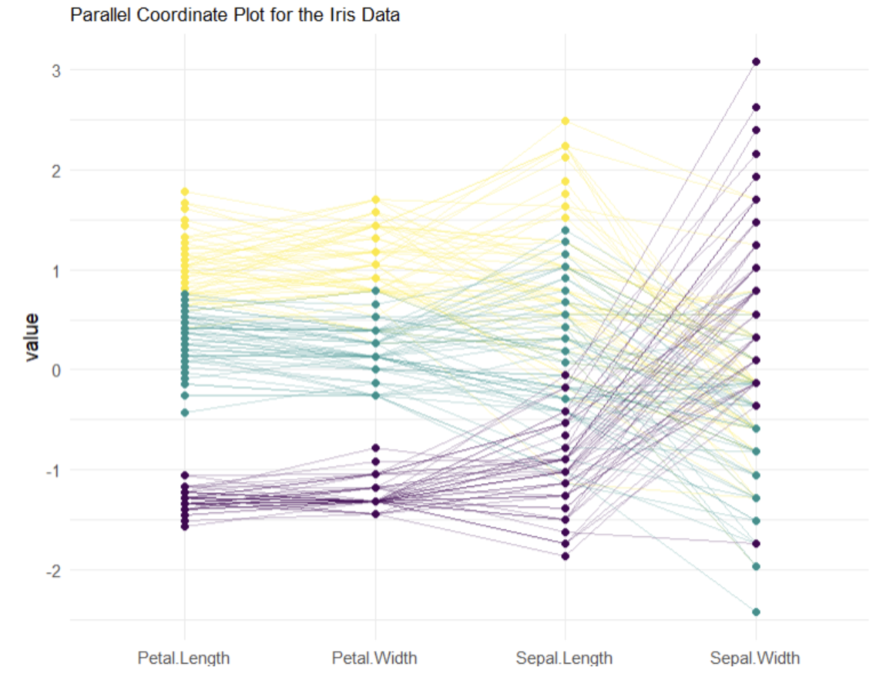
A parallel coordinates plot (PCP) is a data visualization technique that is used to visualize high-dimensional data sets. In a parallel coordinates plot, each variable is represented as a vertical axis, and each data point is represented as a line that connects the values of the variables. These plots are used to compare multivariate numerical data. PCP is used to identify patterns or trends by comparing how numeric variables relate to each other. These plots can be used for dimensional analysis and feature reduction. Parallel coordinates plots can be used to visualize complex data sets, such as gene expression data or metabolomics data, that have many variables. Researchers could use this technique to identify clusters of data points that share similar characteristics or identify variables that strongly influence the outcome.
Parallel coordinates plots can also be used to identify potential outliers or anomalies in the data set. By identifying outliers, researchers can investigate potential errors in the data or identify potential areas of interest for further investigation.
Conclusion
Data visualization can be powerful a tool for improving data analysis, decision-making, and storytelling in laboratory systems. By using heatmaps, Sankey diagrams, and Parallel Coordinate Plots researchers can uncover hidden patterns and relationships in their data, identify potential areas of interest, and optimize the experimental design. Alberto Cairo, a data visualization expert, said “Data visualization is an art of storytelling. It's the art of turning dry data into engaging visual stories that captivate and convince your audience.” Using data visualization techniques in laboratory systems can not only lead to faster discovery and the development of new and more effective treatments and therapies it can also help to communicate these findings to a wider audience.


