

Analyzing the Response of Different Countries to COVID-19 Using Dynamic Time Warping
By: Michal Monselise
As we enter the eighth month of pandemic mitigation measures across the globe, some countries continue to have a low number of daily infections and deaths, others are suffering from a second wave of cases, while some countries haven’t even finished with the first wave of COVID-19. To make sense of the data and find similarities between the different countries, we may use statistical tools at our disposal to quantify the similarities and see whether countries that have similar patterns in the case and death count also had similar responses to COVID-19. In this blog post, we will use dynamic time warping for our analysis.
What is Dynamic Time Warping?
Dynamic time warping is a technique to measure the distance between two time series. The main advantage of DTW is that the two time sequences are not required to be of the same length. We typically use the euclidean distance to compare the two time series.

Credit: Wikipedia
Our goal with DTW is to compare time sequences to identify those sequences with similar patterns. We may use DTW to identify similarities in different types of sequences like historical stock prices or audio data.
Applying DTW to COVID-19 Data
To analyze the pattern for each country, we extracted the daily death count for all countries as provided in the COVID-19 dataset provided by Johns Hopkins University. This analysis will use only the daily death count since different countries have different testing levels. Therefore, analyzing the death count will produce a more reliable result. The data has been processed by shifting all sequences so that the start date is the date of the first day with at least 10 deaths. We then applied a weekly moving average to smooth any effects of less deaths being recorded during the weekend.
For example, below is a plot of a small subset of countries and their smoothed daily death count (note that there was an adjustment of the death count in late May which is observed as a temporary spike in many countries).
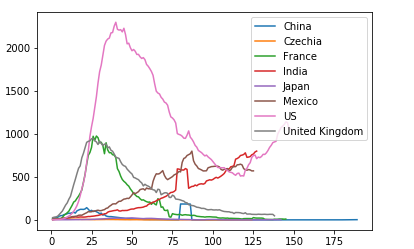
We can see that some countries had a large spike followed by a decline in deaths, others have had a second spike and a third group has been steadily increasing.
When computing the DTW score for each pair of countries, we generate a large number of pairwise distances, therefore, we may visualize the country groupings using a dendrogram which is a diagram that will show us the hierarchy of similarity between the countries.

Since this diagram is very large, let’s look at it up close.
Group 1: The “Out-of-Control” Countries


On the right hand side we see the two countries in blue - The United States and Brazil are deemed the most similar. They are so different from other countries that their cluster is completely separate from all others. These two countries have certainly suffered from high death counts. The pandemic has not been fully controlled in both countries. The countries most adjacent to the US - Brazil cluster are India, Mexico, United Kingdom, Spain, France, and Italy. These are countries that have suffered from high death counts but not as high as the US and Brazil. We observe that India and Mexico are grouped together where rates are rising steadily while Spain, France and Italy are grouped together where there was a significant drop in cases and now we see a second wave.
Group 2: Countries That Suffered a Moderate to Medium Outbreak
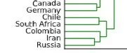


In the countries grouped above, we also see that the closer the grouping is, the more the countries have in common. Canada and Germany are closer together and have kept their daily death count low since the first wave of COVID-19. Chile and South Africa are experiencing an increase in the daily death count and similarly so are Russia and Iran.
Group 3: Countries That Initially Suffered But Now Have the Pandemic Under Control


While China is a large country, Peru, Belgium, and the Netherlands have been particularly hard hit when considering their size. We see that the Netherlands and China have a very similar pattern and are grouped together.
Using DTW, we are able to quantitatively confirm what we may observe by looking at graphs. Using this metric, we can automate the process of comparing time sequences.
CompassRed is a full-service data agency that specializes in providing data strategy for clients across multiple industries.